Since OS X 10.0 launched in 2001 Apple only worked it's way up the ladder with ahead-of-time technology to reach the potential of the OS which we have today. It was a challenge to be ahead of the game competing with Microsoft Windows, so Apple had to come up with a marketing strategy to promote their OS. It all started with the branding of the OS promoting it with big cat names. Here is a timeline of the names since 2001;
(1)
|
Mac OS X 10.0 : Cheetah
|
2001 |
(2)
|
Mac OS X 10.1 : Puma
|
2001 |
(3)
|
Mac OS X 10.2 : Jaguar
|
2002 |
(4)
|
Mac OS X 10.3 : Panther
|
2003 |
(5)
|
Mac OS X 10.4 : Tiger
|
2004 |
(6)
|
Mac OS X 10.5 : Leopard
|
2006 |
(7)
|
Mac OS X 10.6 : Snow Leopard
|
2008 |
(8)
|
Mac OS X 10.7 : Lion
|
2010 |
(9)
|
OS X 10.8 : Mountain Lion
|
2012 |
(10)
|
OS X 10.9 : Mavericks
|
2013 |
As you can see that Apple has ran out of cat names, and I think it is about time. I mean how long would they have gone with it. The lion is the kind of the jungle, I doubt that a mountain lion is ranked higher. Anyway to get to Mavericks. It is actually very clever, the latest OS X is named after the place of birth of Apple, Mavericks - California. This will be a new era for Apple's OS naming it after landmarks and I think it's pretty cool. But to make this more interesting I want discuss the new OS and what it contains.
We all are familiar with the OS interface? if not, see the list below;
| OS X 10.0 ⇢ | 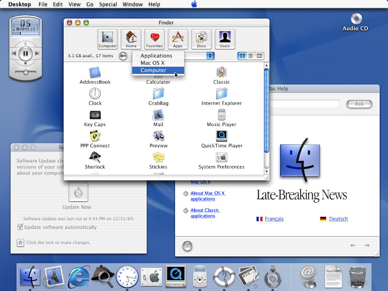 |
OS X 10.1 ⇢ |  |
| OS X 10.2 ⇢ |  |
OS X 10.3 ⇢ |  |
| OS X 10.4 ⇢ |  |
OS X 10.5 ⇢ |  |
| OS X 10.6 ⇢ |  |
OS X 10.7 ⇢ |  |
| OS X 10.8 ⇢ |  |
OS X 10.9 ⇢ |  |
Looking at this list you notice that there hasn't been much change to the interface or where the main controls are place. The task bar is always at the top and the dock is at the bottom. That is how it has always been and probably will stay for the time being. The visual aspects of these components such as the windows and dock just gets enhanced with every operating system keeping up with the new technology.
Apple don't want to follow in the footsteps of Windows latest operating system Windows 8 where they removed the start button and made it more tablet based. I mean they've altered the entire user interface and changed the way people uses a PC! Even though Macintosh also added tablet features gathered from the iOS platform (e.g. Notification Centre and Launch Pad) they've done it in such a way that it is a preference and not a requirement.
Apple don't want to follow in the footsteps of Windows latest operating system Windows 8 where they removed the start button and made it more tablet based. I mean they've altered the entire user interface and changed the way people uses a PC! Even though Macintosh also added tablet features gathered from the iOS platform (e.g. Notification Centre and Launch Pad) they've done it in such a way that it is a preference and not a requirement.

Mac OS X 10.9 - OS X Mavericks
So what is new that makes this OS so popular that people are raving about. Is it maybe the fact that you get new features like reading books on your Mac? Is it because you need to check Apple Maps instead of Google Maps? or is it the new filing system with new added security features? I sure hope that Apple decides to tweak the interface design a little, not so much as the Windows 8 fiasco but enhancing the visual aspects like they did during 2001 and 2006.
Even though OS X is as minimalistic as it may come, I think it could be enhanced. With the upcoming iOS 7, which will be the best and most beautiful OS for mobile Apple has ever designed, I still feel that migrating these design elements of the iOS 7 with the OS X Mavericks will be another mile stone on Apple timeline. Just look at how beautiful transition that happened during 2001 up to 2012. I will write another post about the iOS 7 once it has been released which hopefully will be on the 10 September at the conference in Cupertino.
I did some design of my own! Extracting some elements of the new iOS 7 I migrated it with the OS X interface to give the sense of translucency which is part of the new look and feel. I've added all the new neat features such as the labelling and tabs in the finder window. The intention for the frosted windows are that it changes depending on your wallpaper. I reverted back to the first official dock with a more modern feel in honour of the first OS X. In the right hand corner on the dock I've added a new feature where you can scroll between docks. In my experience I always need to add stuff to my dock but only when I use them. Wouldn't it be cool to add different sets of docks which you can switch to design or editing or writing whenever you like? Last but not least I made some small changes to the classic Apple folder design. I touched it up by making it white with the apple logo in the top corner to give it that special touch.
So we will have to wait and see whether Apple will change the interface a little for the big reveal of the Mavericks OS, by the look of what they posted on their site, I doubt that they will make changes. But hey, it's always nice to imagine "what if."


Rumour has it that the new OS X Mavericks will be released at the end of October 2013! Hoped you guys enjoyed the concept art, tell me what you think down bellow. Like my page, Like my blog and see you guys on Friday at 10:00 SAST for another exciting post.
Till Later!
*F
Even though OS X is as minimalistic as it may come, I think it could be enhanced. With the upcoming iOS 7, which will be the best and most beautiful OS for mobile Apple has ever designed, I still feel that migrating these design elements of the iOS 7 with the OS X Mavericks will be another mile stone on Apple timeline. Just look at how beautiful transition that happened during 2001 up to 2012. I will write another post about the iOS 7 once it has been released which hopefully will be on the 10 September at the conference in Cupertino.
I did some design of my own! Extracting some elements of the new iOS 7 I migrated it with the OS X interface to give the sense of translucency which is part of the new look and feel. I've added all the new neat features such as the labelling and tabs in the finder window. The intention for the frosted windows are that it changes depending on your wallpaper. I reverted back to the first official dock with a more modern feel in honour of the first OS X. In the right hand corner on the dock I've added a new feature where you can scroll between docks. In my experience I always need to add stuff to my dock but only when I use them. Wouldn't it be cool to add different sets of docks which you can switch to design or editing or writing whenever you like? Last but not least I made some small changes to the classic Apple folder design. I touched it up by making it white with the apple logo in the top corner to give it that special touch.
So we will have to wait and see whether Apple will change the interface a little for the big reveal of the Mavericks OS, by the look of what they posted on their site, I doubt that they will make changes. But hey, it's always nice to imagine "what if."
⇢ Flat translucent dock with new OS X icons. Dock refers back to the first OS X 10.0 Cheetah that sits from edge to edge on your screen.
⇢ Frosted translucent Finder windows to makes your workspace just better looking than ever before. Included with colour tags to find your work easier and don't forget those new Finder tabs to open multiple windows in one window like in Safari.

Rumour has it that the new OS X Mavericks will be released at the end of October 2013! Hoped you guys enjoyed the concept art, tell me what you think down bellow. Like my page, Like my blog and see you guys on Friday at 10:00 SAST for another exciting post.
Till Later!
*F
No comments :
Post a Comment