Showing posts with label Campaigns. Show all posts

Friday, May 31, 2013

LIVE Campaign: ODF


In mid 2012 a group of us received a project looking for a cause that we as young graphic designers can help support. The criteria was to find a NGO who are struggling to find support and help them out buy designing a campaign which will turn out to run as a live campaign if the NGO is willing to put their funds towards a campaign.

Our cause we chose was the Organ Donor Foundation (ODF) which helps donate organs to patients in need of organs. We saw this as a potential problem in South Africa because of the lack of donors and the need for organs. We approached the ODF and proposed what we want to do, they where excited to help and supported us all the way throughout the process of the project.

After 6 weeks of planning, designing, and refining some minor details, we presented the final proposal to the ODF and to our department. The concept of the campaign was a success, unfortunately the ODF couldn't run the campaign because of limited funds. In spite of actually running the campaign, we got to experience what it is to plan, design, and present a campaign proposal. Working with the ODF was amazing and we gained experience in working with live clients and understanding the principles of communication.

So here is how it rolled out;

#1: Poster for the 7 day campaign. What the campaign is all about and what activities will happen in 7 days time.
*Click on image to enlarge

#2: Created a hypothetical website that will be launched before the campaign for the campaign and future use. This would be the face for the campaign but still linked to the ODF's official website.

*Click on image to enlarge

*A mobile site will also be launched which will be accessible to a larger audience and draws more traffic to the website self.


#3: We also designed T-Shirts with some humorous quotes to lighten the seriousness of the topic.
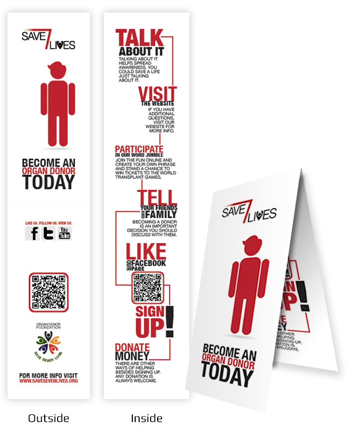
#4: There is also a brochure that has a magnet at the back so you can post it on your fridge and be reminded of the cause. But to make it more interesting to have is it can be used as a bookmark, you can fold the brochure over the edge of you page, and be reminded of the cause when opening a book.

#5: Last but not the least, we made 2 videos which shows how you as an individual can save 7 lives one day by signing up as an organ donor. We made use of silhouettes so it applies to everyone out there. It is also effective because any person can relate to it, and of course some humour was incorporated to keep the audience attention and make them feel good.

- KINETIC TYPOGRAPHY -

- WE ARE ALL CONNECTED VIDEO -

This was an amazing project and one of my best team efforts I ever dealt with. I enjoyed it tremendously even though we didn't sleep much! I want to give recognition to my team members; Nadia, Gina, and Robert for working together on this project. We are a well oiled group which can take on any challenge.

So please sign up and become an organ donor! Even from 6 feet below, you can make a difference to 7 above.

Till Later!
*F

Sunday, April 1, 2012

Invisible Borders. Moving Perceptions.

Hi guys, here is something you might like.
As designers we have obligations to certain things in life. One of those obligations are problem solving because we are problem solvers and communicators. So I was asked to work in a group where we were divided in 5 sectors n.l. Move, Play, Eat, Work, and Sleep. This project needed to have an issue/ problem in the specific sector in Cape Town, South Africa.

My group got 'Move' with hints like; mobility, traffic, transport, etc. But we decided to take another route and choose to work with the topic figuratively. We looked at problems in this sector and found that people in the Cape are actually living separately lives but talks as if they are one city. We needed to highlight this problem, deconstruct this issue and try to find a solution.

For our proposal to the WDC (World Capital Design) we created a video presentation that highlights our problem, how it started and asking the question 'why is it still going on? why re-live history?'

OUR TOPIC TITLE:
Invisible Borders. Moving Perceptions.

*can't view this?

So we impressed the board of the WDC with our rad video editing skills and it was a kick ass presentation! ;-) We needed to get the boards attention and make them aware of this problem. They will then decide to use one of the issues to support and solve it before 2014.

We also had to create some sort of 'leave-behind' so they can take it with them and present it to their board. (A lot of presenting... but that is life!) Anyway so we created a DVD cover where our presentation was put onto a disc and into this cover to give it to the WDC guys. This does not only acts as a DVD cover but it unfolds as a poster with two sides (Because every problem has two sides to it).

- The one side shows how the citizens of Cape Town perceive the different areas in the city. This is the front cover where we decided to make it in the form of Cape Town (Die-cuted) with the invisible borders of how people perceives it. It unravels into a mosaic with all the hate and bad imagery of people and the media.

- The back side is the positive images where the areas in the city actually looks like that and is good and not what people make it to be. We linked these images with each other from good to better to best to show how you can move your perception.

Here is how it looked:

So we hope to have captured the peoples attention and that they will see this a big problem and that we need to stand up and do something about this before it gets even worse. Cape Town is drifting apart even though people don't see it.

This was my first official proposal to a big organization and though it was hectic doing it, I enjoyed it a lot! Creating a campaign or writing up a brief of a problem is NOT as easy as it sounds. But I think my group and I did a great job! Thanks guys for all the help!

Till Later!
*F

Sunday, March 18, 2012

Make Some Noise - Limited Edition Merchandise


Did an awesome project a month ago that we needed to think of an issue (or personal issue) and make it aware on a poster. I chose puma as my sponser and designed a T-shirt as my limited edition object. For this limited edition object I had to designed the packaging as well.

My issue is reckless driving and people who speed. My target market was urban youth. The style I used is a graphic style that is a very common with race car stickers. I illustrated the whole graphic and used a colour pallet of two colours, black and red. I illustrated two dices flinging towards the audience because of a car crash. The tagline is at the bottom and is illustrated into a odometer. The 'C' of the dice is flipping which changes the tagline to 'Wanna Dice?' to 'Wanna Die?'

This was a really great project and I am thinking more of going into the packaging and printing profession!

Till Later!
*F